Federal Dynamics

Project
Logo, brand identity, web and print design for Federal Dynamics, the biggest protection company in the world.
Brand identity
The brand identity of Federal Dynamics, as crafted by designer Dosta Design, embodies a sense of authority, precision, and global professionalism, aligning seamlessly with the company’s stature as a leading provider of executive protection and corporate risk management services.

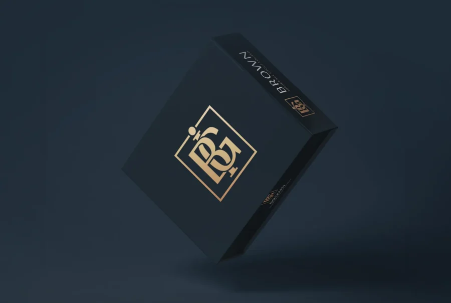
Logo Design
The logotype draws inspiration from aviation and modernist-era logos, resulting in a design that is both laconic and elegant. This approach reflects a continent and austere aesthetic, emphasizing clarity and strength—qualities essential for a company operating in high-stakes security environments.
Visual Identity Elements
Typography: The choice of typography is likely to be clean and sans-serif, reinforcing the brand’s commitment to clarity and professionalism.
Color Palette: While specific colors are not detailed, the overall design suggests a restrained palette, possibly utilizing neutral tones to convey seriousness and reliability.
Imagery and Composition: The visual elements are expected to be minimalistic, focusing on structured layouts that communicate order and control, resonating with the company’s operational ethos.

Brand Personality
Federal Dynamics’ brand identity communicates a narrative of discretion, discipline, and global competence. The design choices—rooted in modernist principles—underscore the company’s focus on precision and trustworthiness, essential traits for clients seeking security and risk management solutions.securitas.com
In summary, the brand identity of Federal Dynamics is a cohesive blend of modernist design and strategic minimalism, effectively conveying the company’s core values and market positioning.


Scope
A vast body of materials has been meticulously crafted — from the corporate website and print brochures to stationery, branded accessories, and a unified system of corporate imagery.